How Do You Translate a Chandelier Moment into a Mobile Design?
A chandelier can change the feeling of a room before anyone has taken a seat. It draws the eye upward, marks a place as special and gives the space here a centre of gravity. On a phone, there is no ceiling to look toward and no grand entrance to pass through. The designer has a narrow, upright frame, a moving thumb and a few seconds to make an impression.
That is the challenge: not to shrink a ballroom until it fits a screen, but to understand what the chandelier does and recreate those effects with care. Casino glamour offers a recognizable visual vocabulary—glinting light, rich materials, dramatic contrast and a sense of occasion. But a successful mobile design does not need to reproduce every flourish. It needs to choose the details that carry the mood, then give navigation and content room to work.
That distinction matters whether someone is browsing a casino’s digital offering, looking at an editorial feature or watching live studio broadcasts on a phone. The screen is not a miniature room. It is its own environment, with its own rules for attention, scale and movement.
Start with the feeling, not the fixture
In a physical interior, a chandelier is rarely just a light source. It can signal arrival, establish a focal point and make a gathering feel more ceremonial. The same is true of other casino interiors: a patterned floor may guide a visitor through a lobby; a sculptural ceiling may slow the pace; a velvet banquette may suggest that a corner is meant for lingering.
These choices work together. The chandelier becomes meaningful because of what surrounds it: the height of the room, the way surfaces reflect its glow, the contrast between a bright centre and quieter edges. Isolated from that context, the fixture is only a decorative object.
That is why translating a chandelier moment begins with a question: what should the visitor feel or understand? Perhaps the experience should feel composed and welcoming. Perhaps the design should suggest a special occasion without making the interface hard to use. Once that purpose is clear, the visual treatment can be edited to suit the screen.
Separate atmosphere from ornament
Casino interiors have a strong visual shorthand. Gold tones, glossy stone, mirrored surfaces, deep colours and dramatic lighting can quickly evoke a formal gaming room or a grand hotel. The shorthand is useful, but it is not a design brief by itself. An image of a chandelier placed behind every button does not automatically create atmosphere. It may simply make the controls harder to read.
Designers should look for the qualities behind the object. A chandelier may provide a focal point, a pattern of repeated highlights or a feeling of vertical lift. Those qualities can be expressed through a restrained glow behind a heading, a small repeated motif or a clear hierarchy that leads the eye from welcome message to primary action.
In other words, the aim is not to put a ballroom on a phone. It is to create a small, legible impression of occasion.
What makes an interior feel like an occasion?
Interior design creates ceremony through relationships between elements. A striking ceiling matters because it contrasts with the room below. A polished surface feels distinctive when it catches a controlled light. A formal lounge feels considered when its furniture, circulation and sightlines work as a whole.
For mobile design, these ideas can be translated into a few practical ingredients:

- A focal point: Give the screen one leading visual element, such as a hero image, featured title or welcome message.
- Contrast: Use changes in tone, scale or texture to distinguish important content from supporting detail.
- Rhythm: Repeat a small number of visual cues—such as a fine border or restrained highlight—rather than introducing a new flourish in every section.
- Negative space: Leave enough breathing room around text and controls. Empty space is part of the composition, not a missed opportunity to decorate.
- Material suggestion: Use texture, colour and reflection sparingly to suggest polished surfaces or rich fabrics without making the interface feel heavy.
These choices can create a sense of occasion without confusing visual polish with usability. A gold accent, for example, may distinguish a featured action; if it is used on every label, divider and icon, it loses its role and competes with the information.
Selective lighting effects, not a screen full of sparkle
Selective lighting effects can carry the spirit of a chandelier more effectively than a detailed illustration of one. A soft highlight around a featured area can guide attention. A slow, subtle change in brightness might add depth to a promotional image. A restrained gleam on a button can make its position clear—provided the button remains easy to read and operate.
The word “selective” matters. Brightness and movement are powerful because they attract notice; if every element glows, pulses or shimmers, none of them has priority. On a small screen, that excess can also compete with text and make the page feel unsettled. Lighting effects should point toward meaningful content, not keep asking for attention.
It is also important to keep the effects accessible and considerate. Text should maintain strong contrast, animation should not be necessary to understand an action, and movement should be restrained enough not to distract. The aim is atmosphere in service of clarity—not a visual performance that takes over the task.
Use hierarchy to create a sense of movement
People move through a physical room by reading cues: a brighter doorway, a reception desk, a change in floor pattern or a line of sight toward the next space. A mobile visitor moves differently. They scroll, tap and scan. The design must build a route through content using order, emphasis and clear transitions.
This is where visual hierarchy takes on the work of architecture. A strong heading establishes where the visitor has arrived. A prominent image or feature gives the page a centre. Supporting information follows in a sequence that feels understandable, while navigation remains easy to find.
A useful mobile composition might move from a short welcome, to a featured area, to a clear action, and then to supporting choices. The sequence should make sense even if the visitor scrolls quickly. Each section needs a reason to be there, just as each part of an interior should contribute to circulation or comfort.
Make the journey legible
Designers sometimes try to recreate a grand entrance with a full-screen image, a decorative logo and several layers of effects. That can work as a brief opening moment, but the visitor still needs to know where to go. If navigation is hidden beneath the visual treatment or the main action is unclear, the entrance has become a barrier.
Instead, give the screen one dominant cue at a time. Use typography and spacing to establish a reading order. Place the most useful action where it can be found without hunting. Keep secondary options visible enough to understand, but distinct enough not to interrupt the main route.
Think of the experience as a sequence of small rooms rather than one grand hall squeezed into a rectangle. A clear top section can welcome the visitor; the next can present a featured option; later sections can offer detail or alternatives. Consistent spacing and familiar controls help each transition feel intentional.
Small frame composition: edit for the phone
Small frame composition is not merely a matter of scaling down desktop artwork. A phone changes what can be seen at once, how much detail remains legible and where a thumb can comfortably reach. A wide, richly decorated casino interior may be compelling on a large display but become a dark tangle of shapes when cropped to a narrow portrait frame.
Editing is the answer. Choose a single focal area instead of trying to show the entire room. Crop with purpose: retain the chandelier’s silhouette or a distinctive reflection, but remove details that do not add meaning at mobile size. Keep important text away from busy parts of the image. Let one strong visual do the work of several weaker ones.
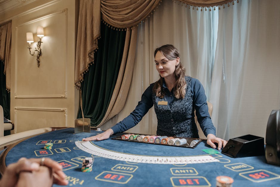
There is a difference between atmosphere and information density. A textured background may suggest a crafted interior, but a textured background behind small labels can make the labels harder to read. A dramatic photograph may establish the setting, but if it pushes the main action below the first screen, it may be doing more work for the image than for the visitor.
Interior cue Possible mobile translation What to protect Chandelier as focal point A single hero image, glow or highlighted feature Clear text and an obvious next action Polished stone or mirror A restrained reflective accent or tonal gradient Contrast, especially around controls Formal room layout A consistent vertical sequence of content sections Simple navigation and predictable scrolling Rich upholstery or patterned detail A limited texture used in a contained area Legibility and uncluttered compositionThe table is a starting point, not a style recipe. A mobile layout should be tested on actual devices and at different text sizes. What looks balanced in a design file may feel cramped in a browser, particularly when menus, browser controls or accessibility settings affect the available space.
Borrow cues with context, not imitation
Casino glamour is recognizable, but it does not belong to one fixed look. The Casino de Monte-Carlo, for example, is associated with a specific sense of history and formal architecture. Referencing that kind of setting can help explain the visual vocabulary of casino interiors; it does not mean a digital product should reproduce its rooms pixel for pixel. A direct imitation may borrow the surface while missing the qualities that make the space coherent.
Editorial coverage offers another way to understand the relationship between setting and presentation. CNA Luxury (Channel NewsAsia) often sits within a broader conversation about design, travel and high-end experiences. When a publication frames an interior as part of a story, its photography, captions and layout work together to give context. A mobile casino interface has a different purpose, but the same principle applies: imagery is more persuasive when the surrounding structure explains why it is there.
For a digital brand such as MrQ, the question is not how to dress every screen as a grand casino. It is how to create a recognizable, consistent experience while keeping the service straightforward to use. If phone browser access is available with no required app download, that ease of entry is itself part of the product’s presentation. The design should make the route into the experience clear rather than burying it under a theatrical opening.
References to physical glamour should also avoid turning a venue into a costume. Casino style is not a dress code, and it does not require the visitor to accept old assumptions about who belongs in a room. On digital platforms, clarity, welcome and ease of use are design qualities in their own right. They can sit alongside visual richness without pretending that every screen needs to look expensive.
Live studio broadcasts and the moving focal point
Live studio broadcasts introduce a special challenge: the focal point is no longer a still image. The camera may shift between a presenter, a table and on-screen information. On a phone, the broadcast and the interface share limited space, so the design around the video needs to stay disciplined.
A useful approach is to let the broadcast provide the movement while the interface provides the structure. Keep controls in predictable positions. Separate supporting information from the video where possible. Avoid adding decorative animation at the same time as important action or information appears in the broadcast. If the video is the chandelier moment—the thing drawing the eye—the surrounding design should not compete with it.
That does not mean the interface must feel plain. A considered frame, restrained accent colour and consistent typography can give a broadcast a clear visual identity. But controls need to remain visible and usable, particularly when the screen is held in one hand. The visual treatment should support the viewing experience, not interrupt it.
A practical process for translating the moment
Before choosing effects, designers can work through a short sequence. It helps separate the emotional purpose of a reference from its decorative details.
- Name the effect. Decide what the chandelier contributes: focus, ceremony, contrast, a point of arrival or a sense of height.
- Choose one mobile expression. Translate that effect into one strong image, a controlled highlight, a spatial pause or a clear typographic hierarchy.
- Remove competing decoration. Check whether textures, borders and animation clarify the screen. If they only occupy space, take them out.
- Test the small frame. Review the design on a phone, in portrait orientation and under ordinary viewing conditions. Make sure key text and actions remain visible.
- Check the full journey. Follow the route from entry to the main content. The atmosphere should be present without making navigation slower or less clear.
Measure the experience, not the sparkle
Visual quality is not a count of how many effects a screen contains. A useful review asks whether people can identify the main content, understand the available actions and move through the experience without unnecessary friction. It also asks whether the design feels coherent from one screen to the next.
Design teams can compare versions with different image crops, emphasis and spacing. They can check contrast, test controls with one hand and observe how the page performs on common phone sizes. These checks do not make an interface less atmospheric. They help the atmosphere survive contact with the real device.
The chandelier is a cue, not a template
Translating a chandelier moment into mobile design is an exercise in interpretation. The physical fixture may be large, intricate and surrounded by architectural detail. Its digital equivalent can be much smaller: one carefully placed highlight, a focused image, a deliberate pause in the layout or a clear path through content.
When designers work from purpose rather than imitation, casino glamour becomes useful instead of overwhelming. Selective lighting effects can draw attention without turning every surface into a spotlight. Implied luxury cues can suggest craft and occasion without claiming that every choice is lavish. Small frame composition can preserve the mood while giving text, controls and movement the space they need.
The best mobile translation is not a miniature ballroom. It is a well-composed screen that knows where the visitor should look, what they can do next and which details are worth keeping. The chandelier’s real lesson is not “add more sparkle.” It is “give the important thing a place to shine.”